Microsoft Edge:
Feedback Redesign
Simplifying and optimizing UI
Microsoft circa 2021
- Product Designer 3
- UX
- UI
- Visual Design
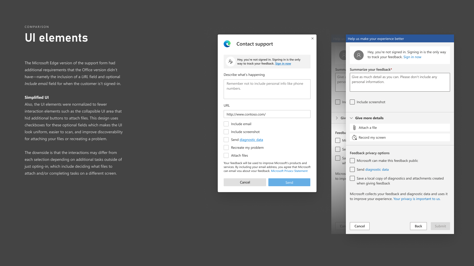
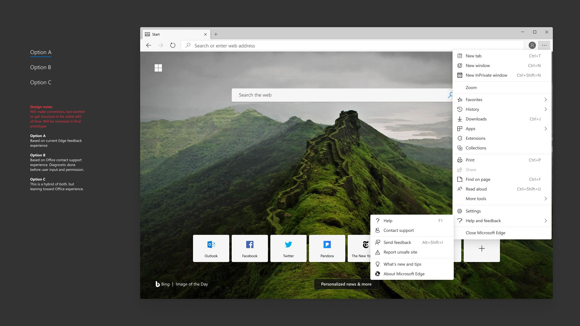
Microsoft Edge customer support wanted to redesign their feedback experience using Microsoft Office's as the baseline. I was leant to their team to help them with an upcoming UX study, spending a few days few days drawing up the screens for this study (it also helped that I had originally designed the dialog/modal system when I was a full-time employee).
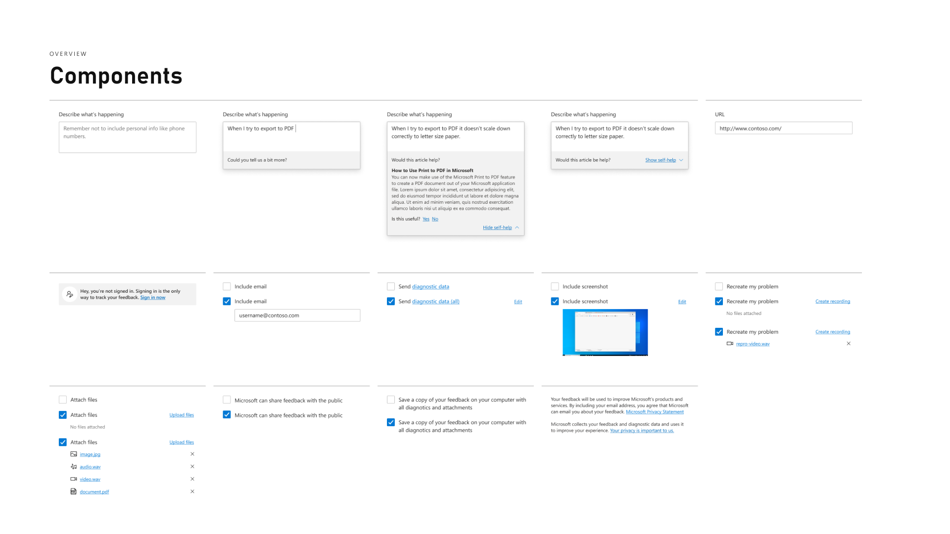
Before & After
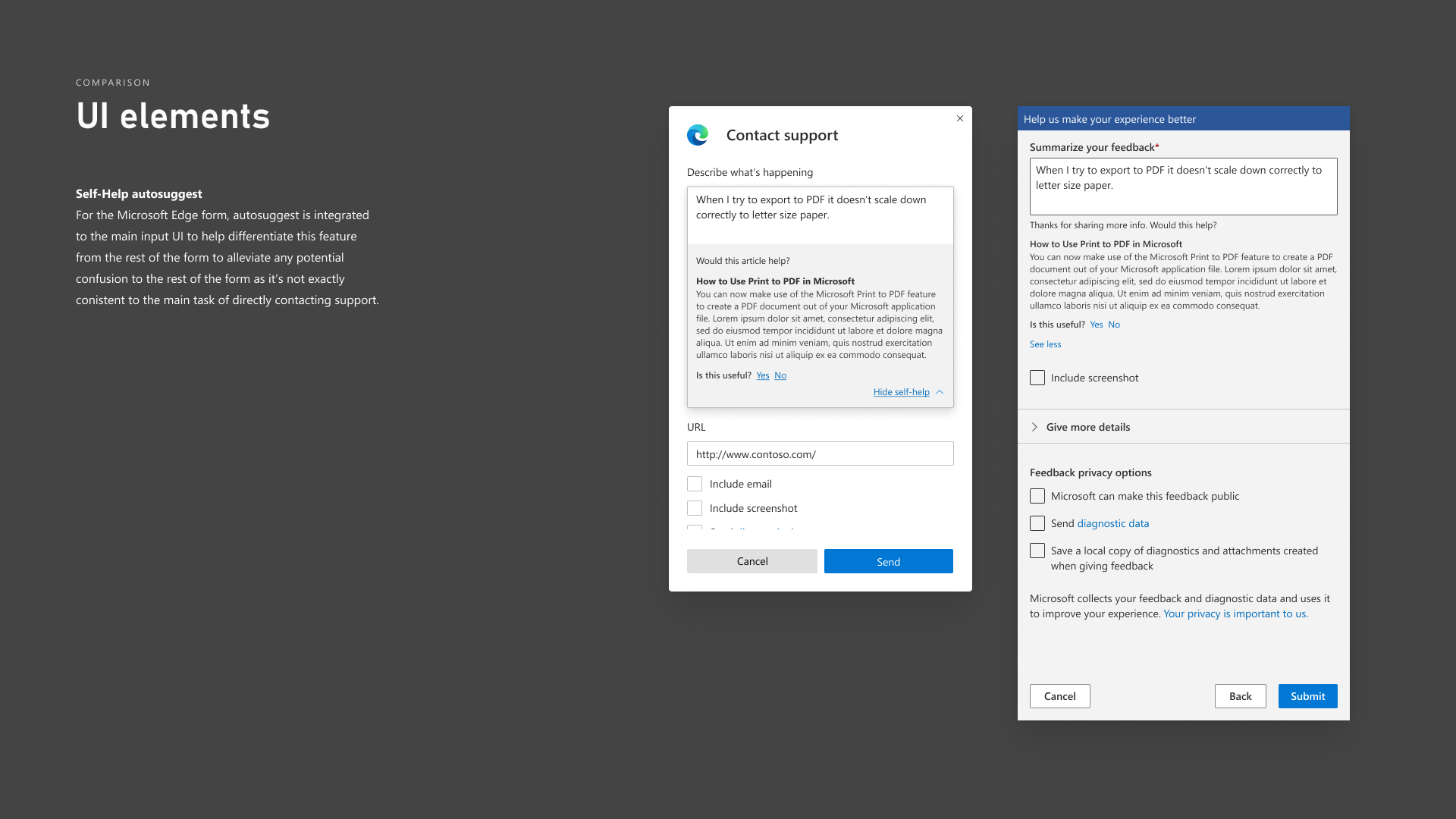
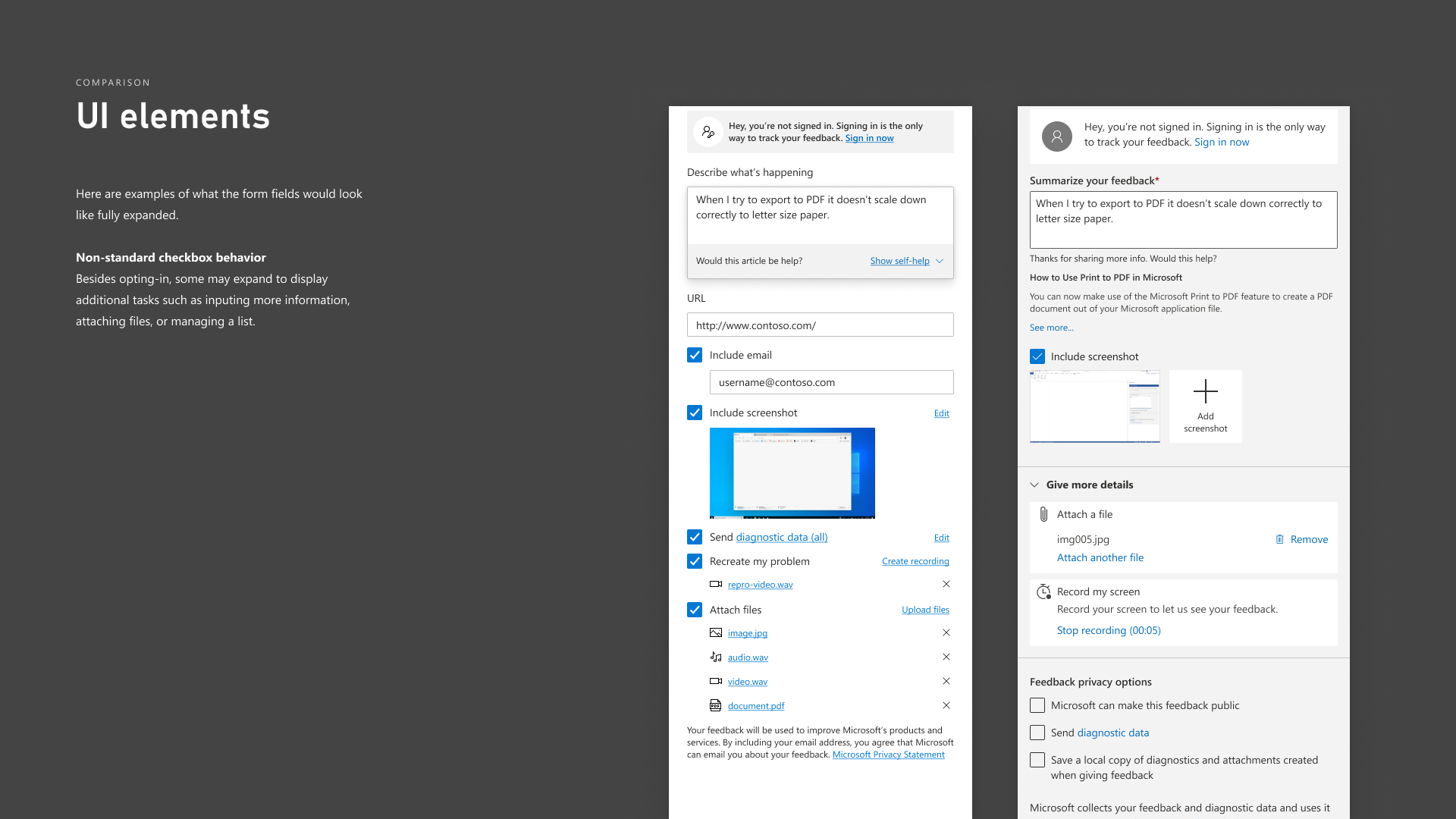
Microsoft Design and Office have somewhat differing takes on the Fluent design system and user interaction/interface design.
I had thought Office made some odd UI choices. One of the key features of the recommended design was to make the form look and feel less complicated to fill out.
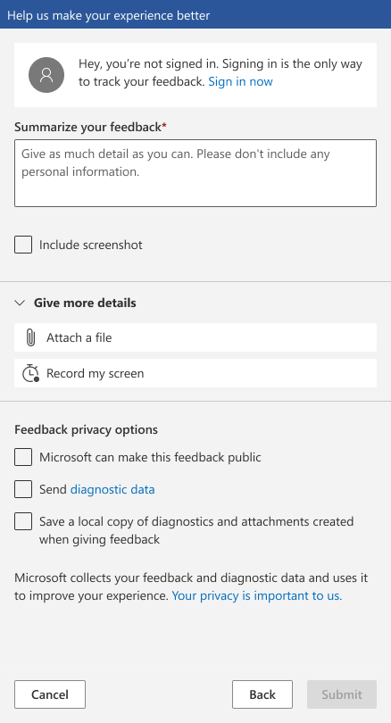
Paper Prototype
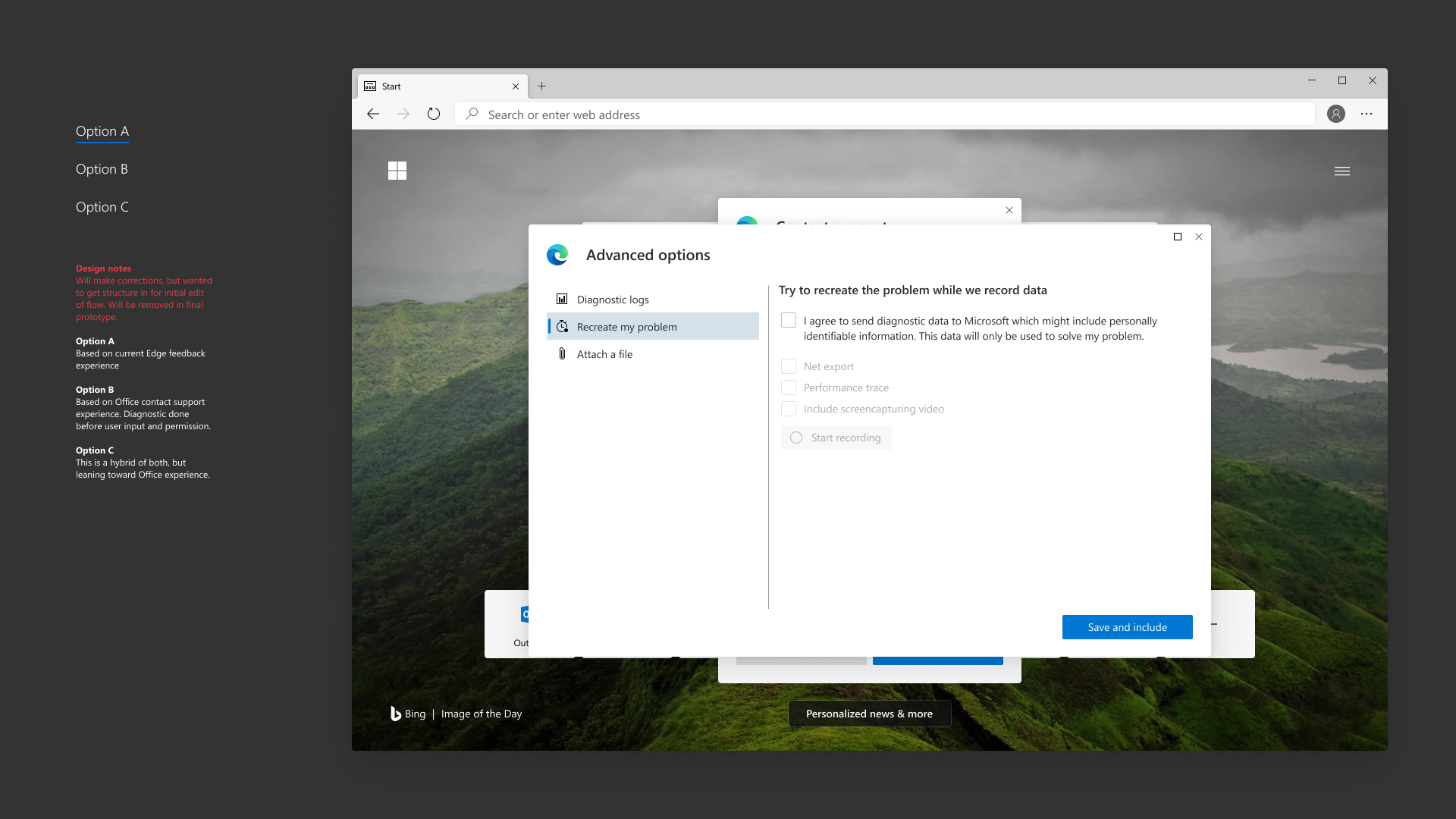
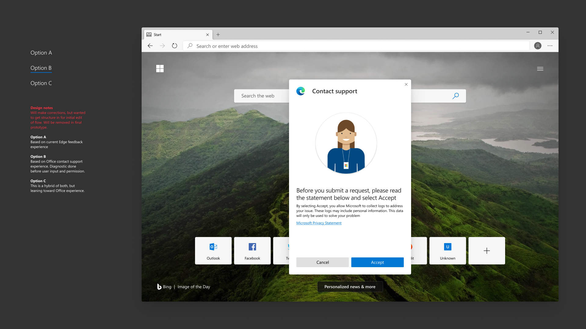
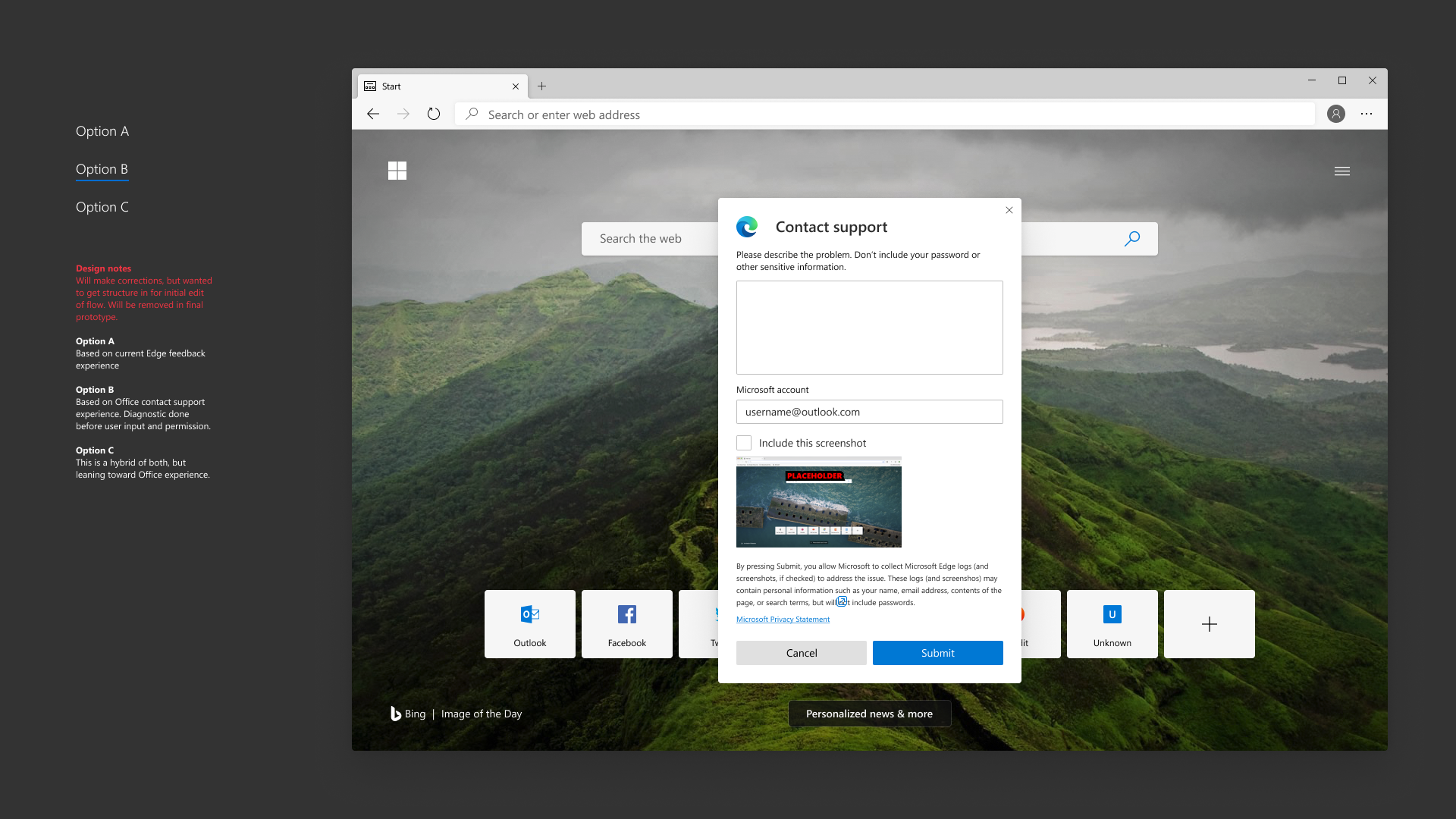
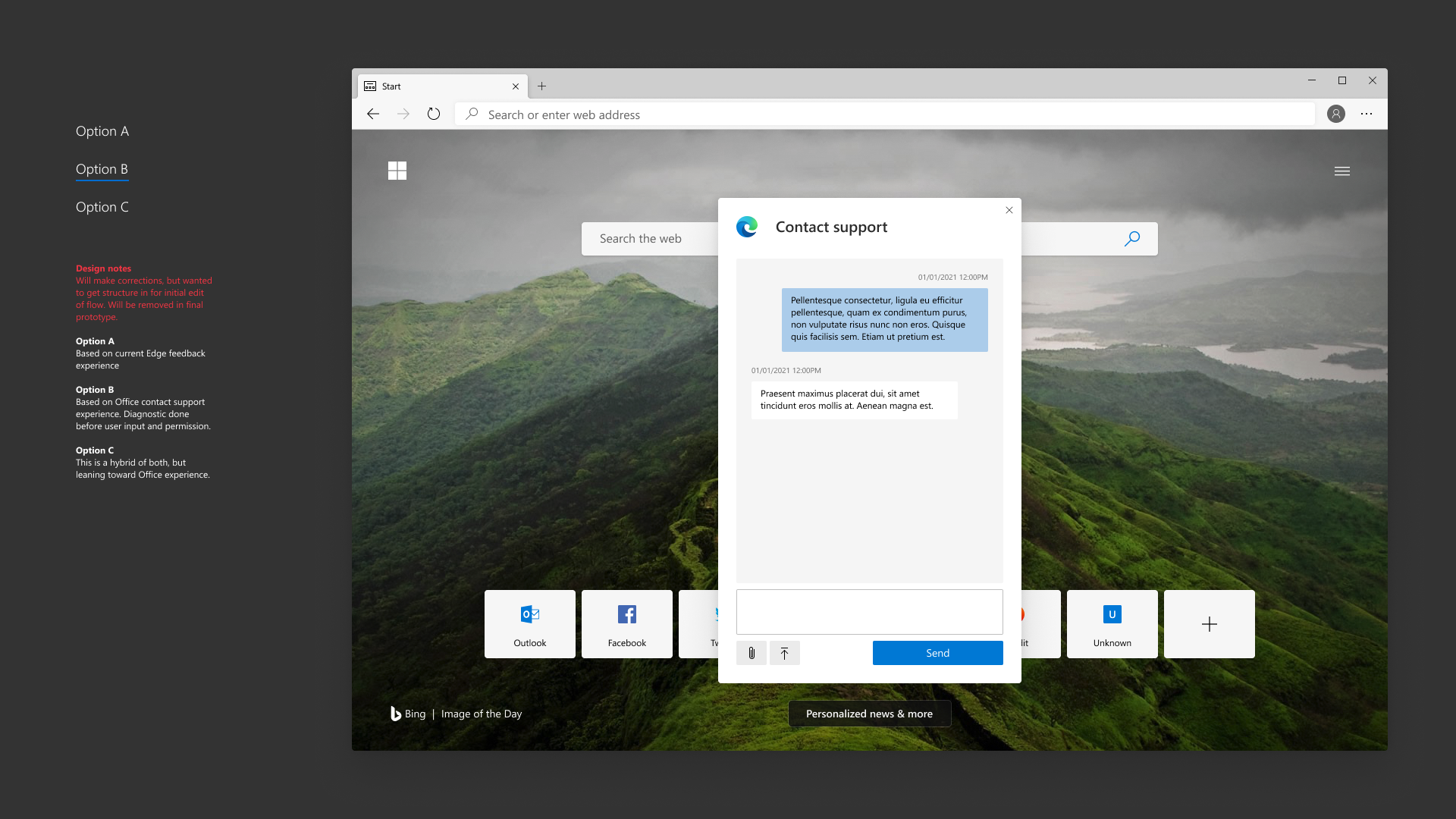
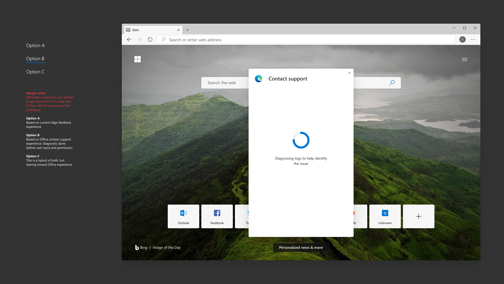
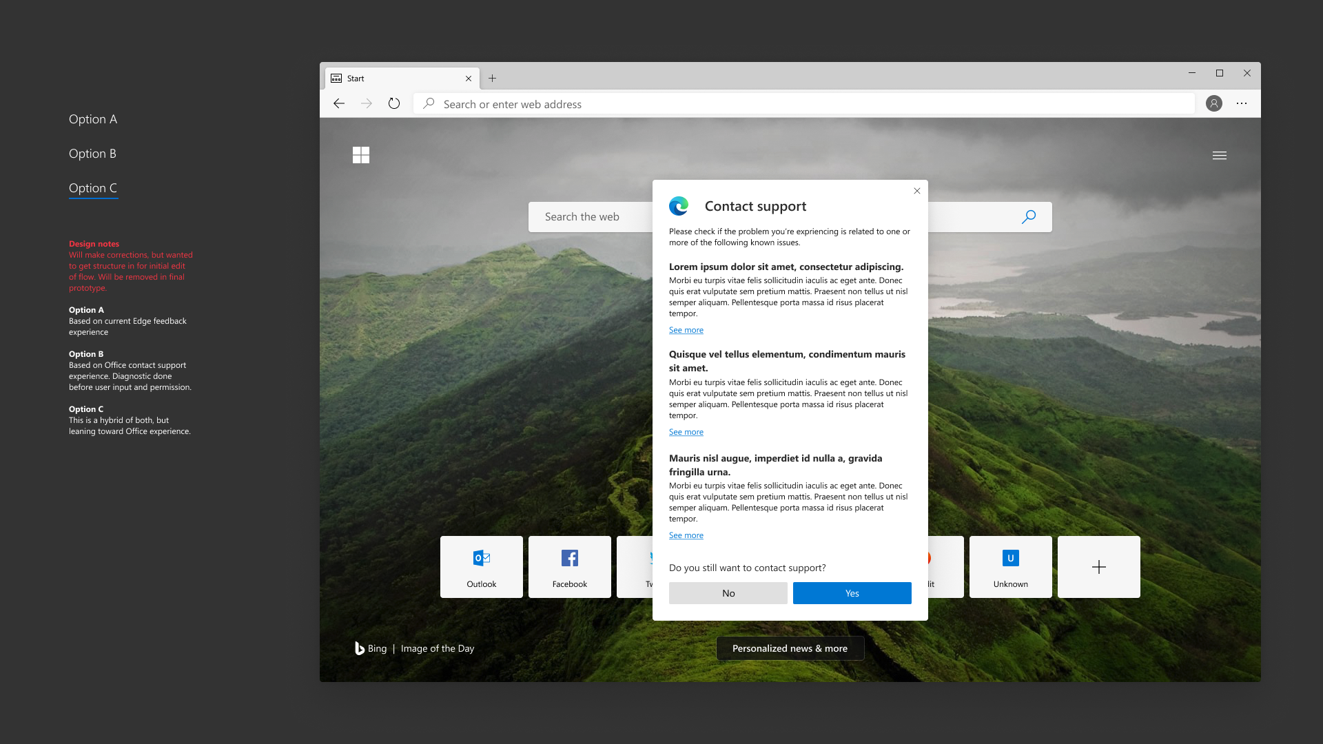
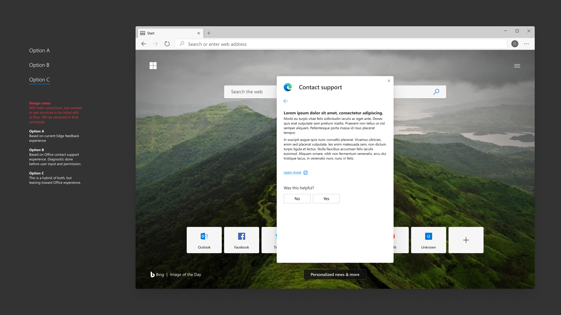
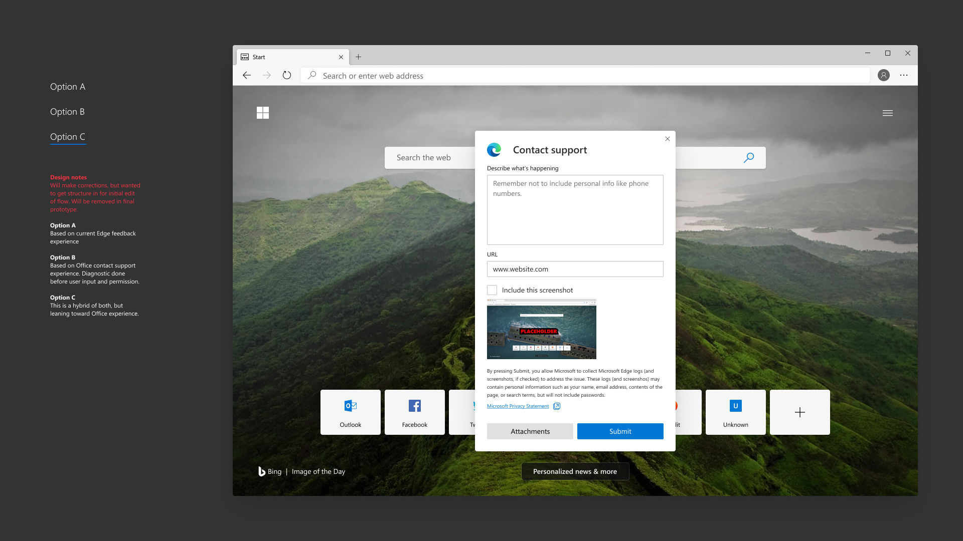
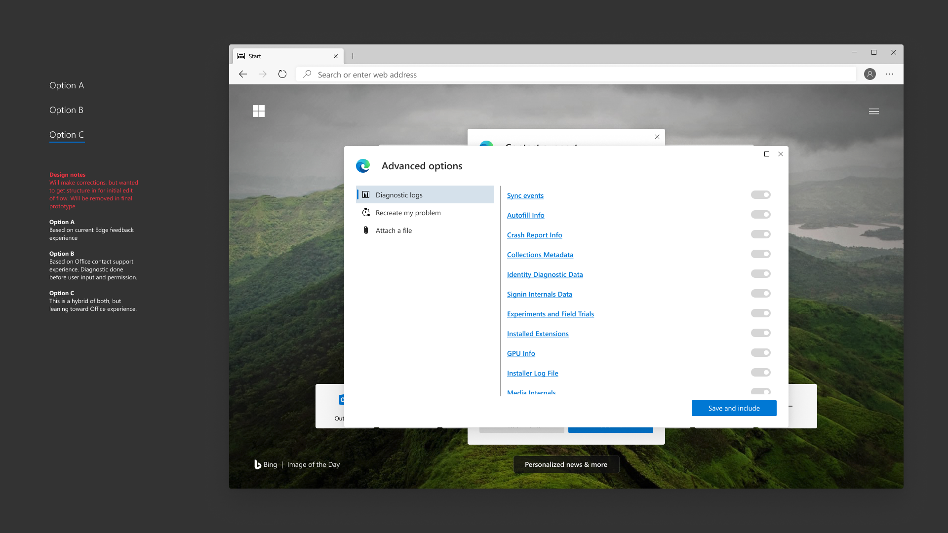
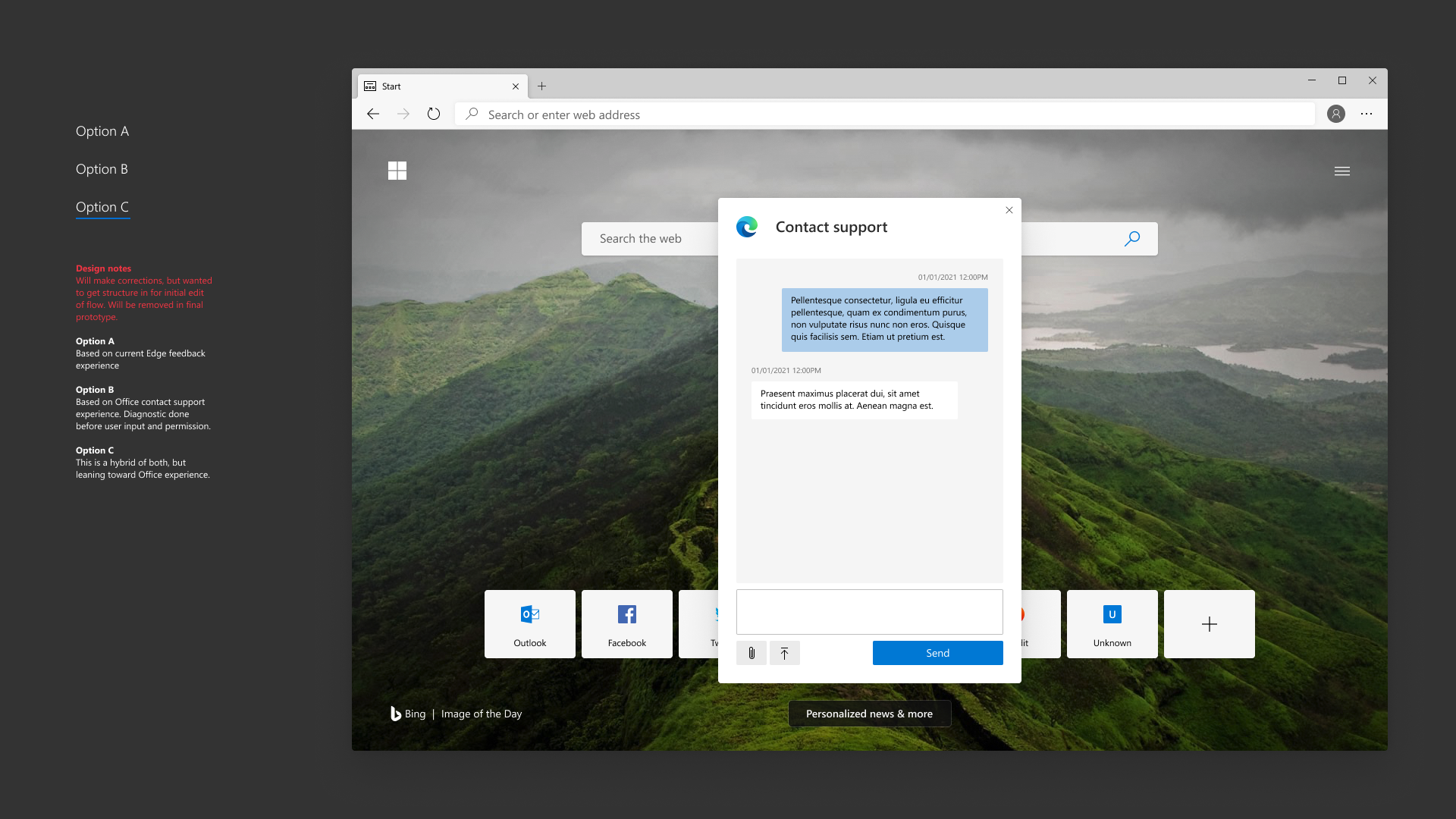
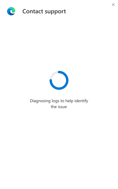
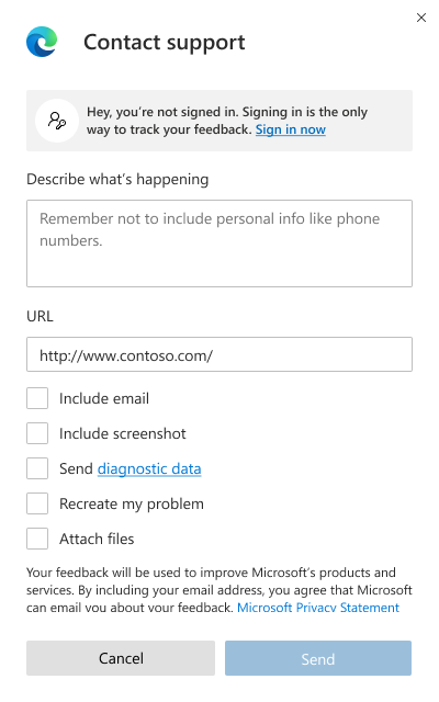
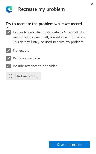
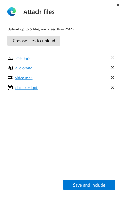
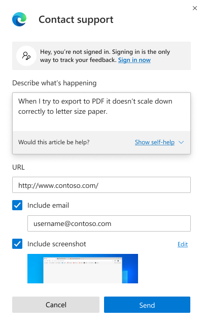
The goal for the study was to take the tester through 3 different options of the experience.
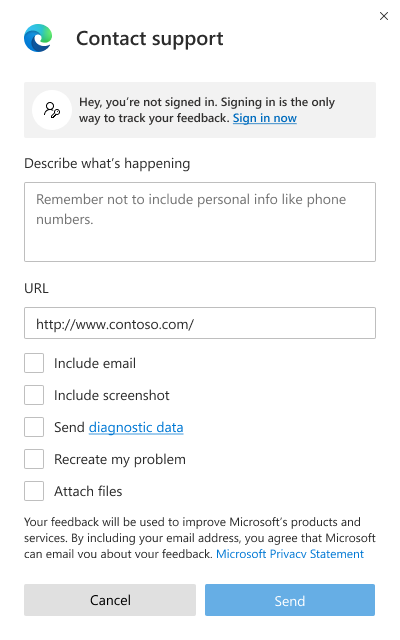
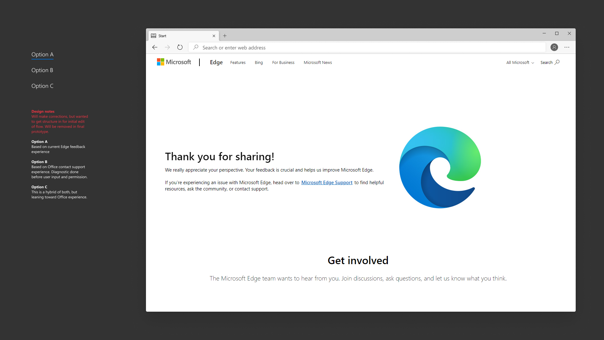
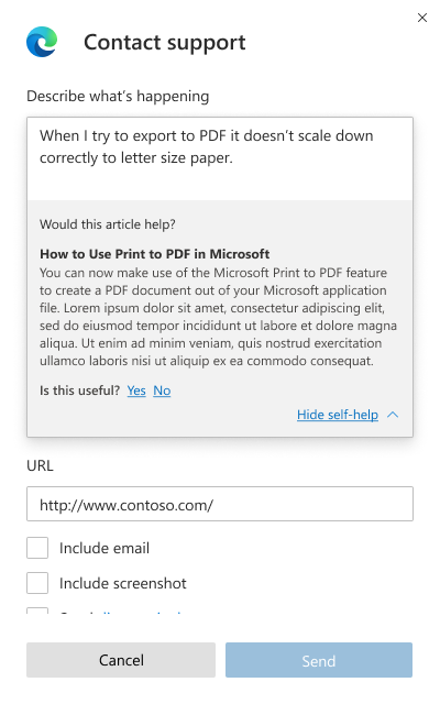
- Option A: Based on the current Edge feedack experience.
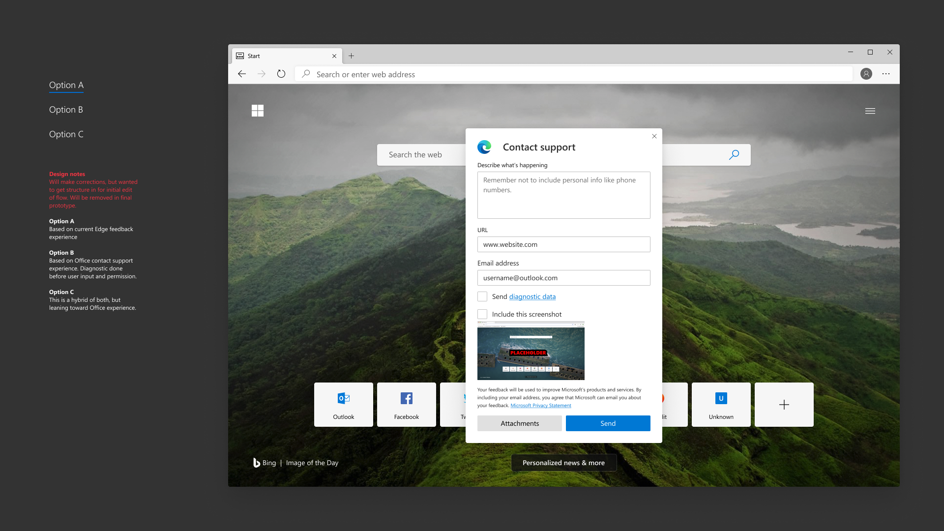
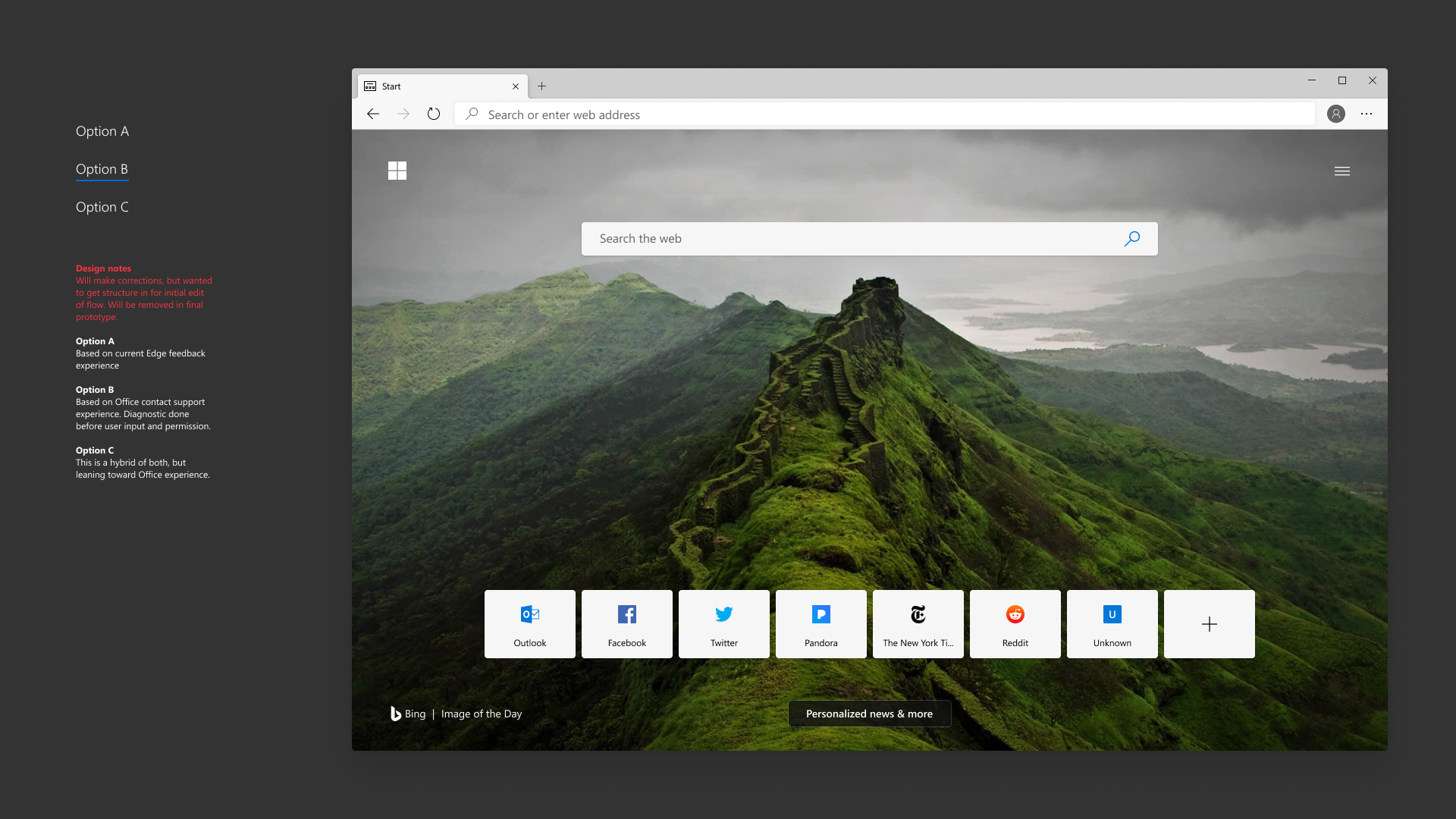
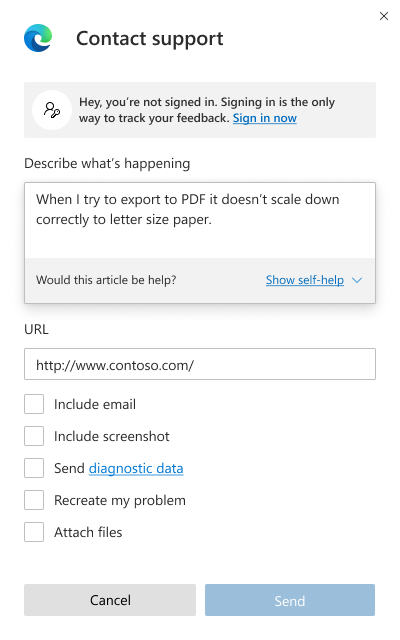
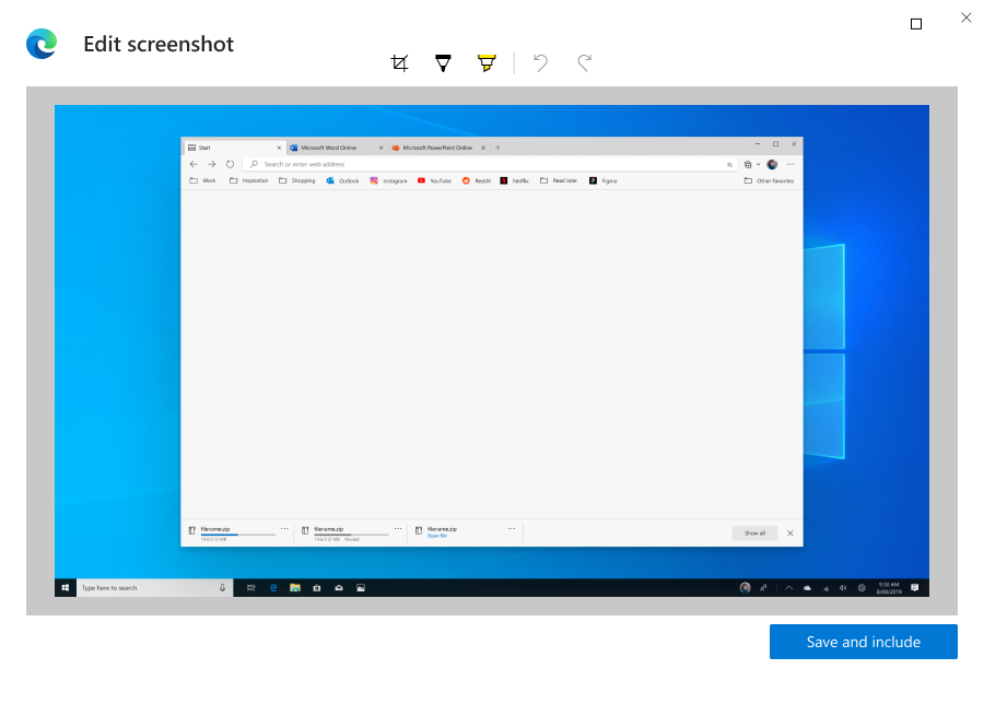
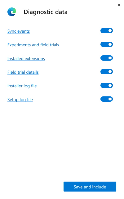
- Option B: Based on the current Office contact support experienc with diagnostics done before user input and permission.
- Option C: A hybrid of both but leaning toward the Office experience.


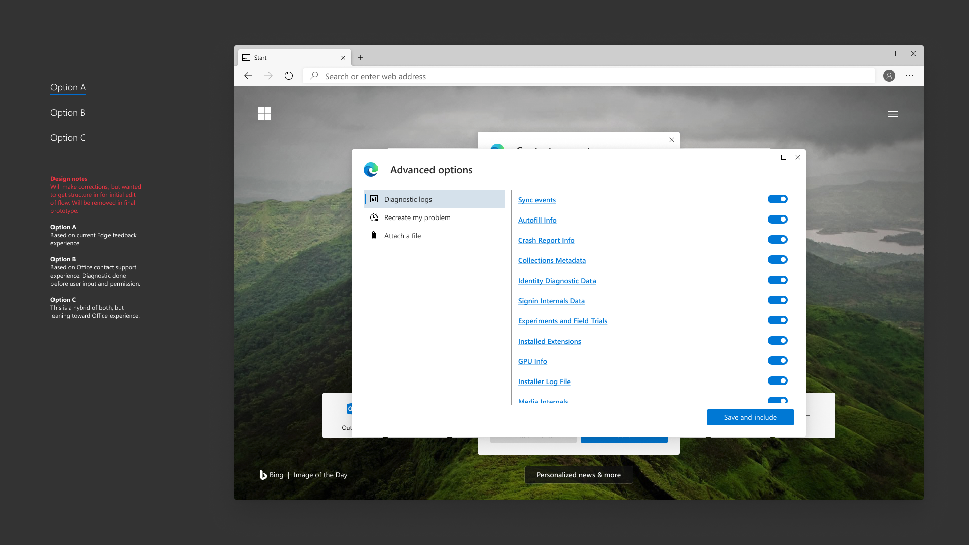


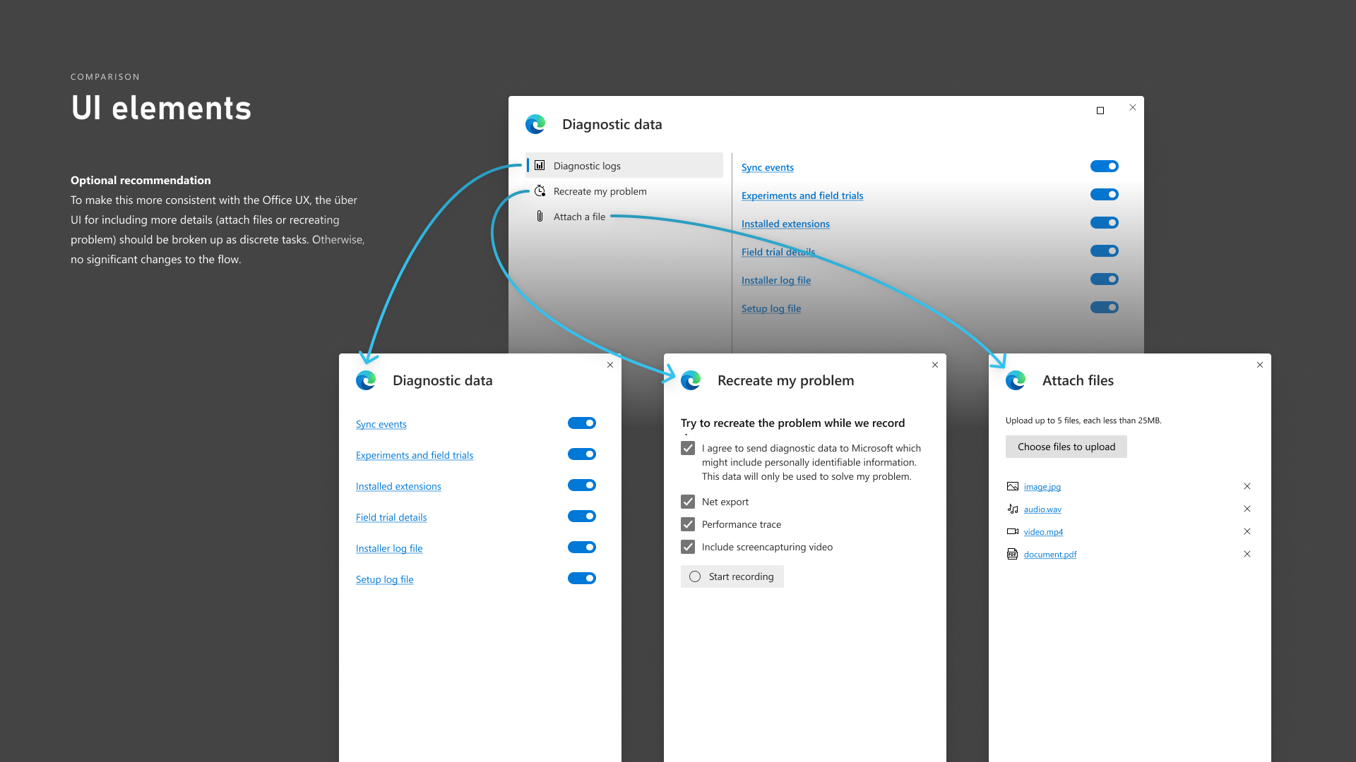
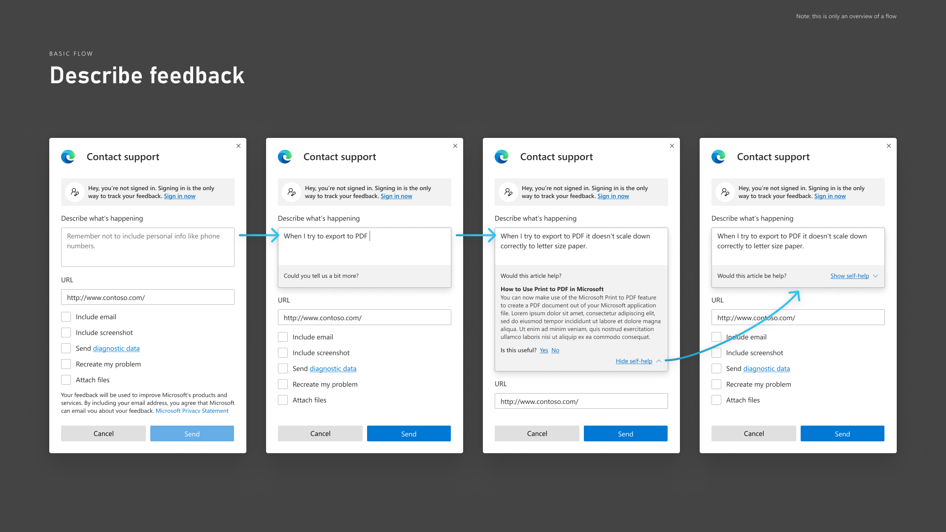
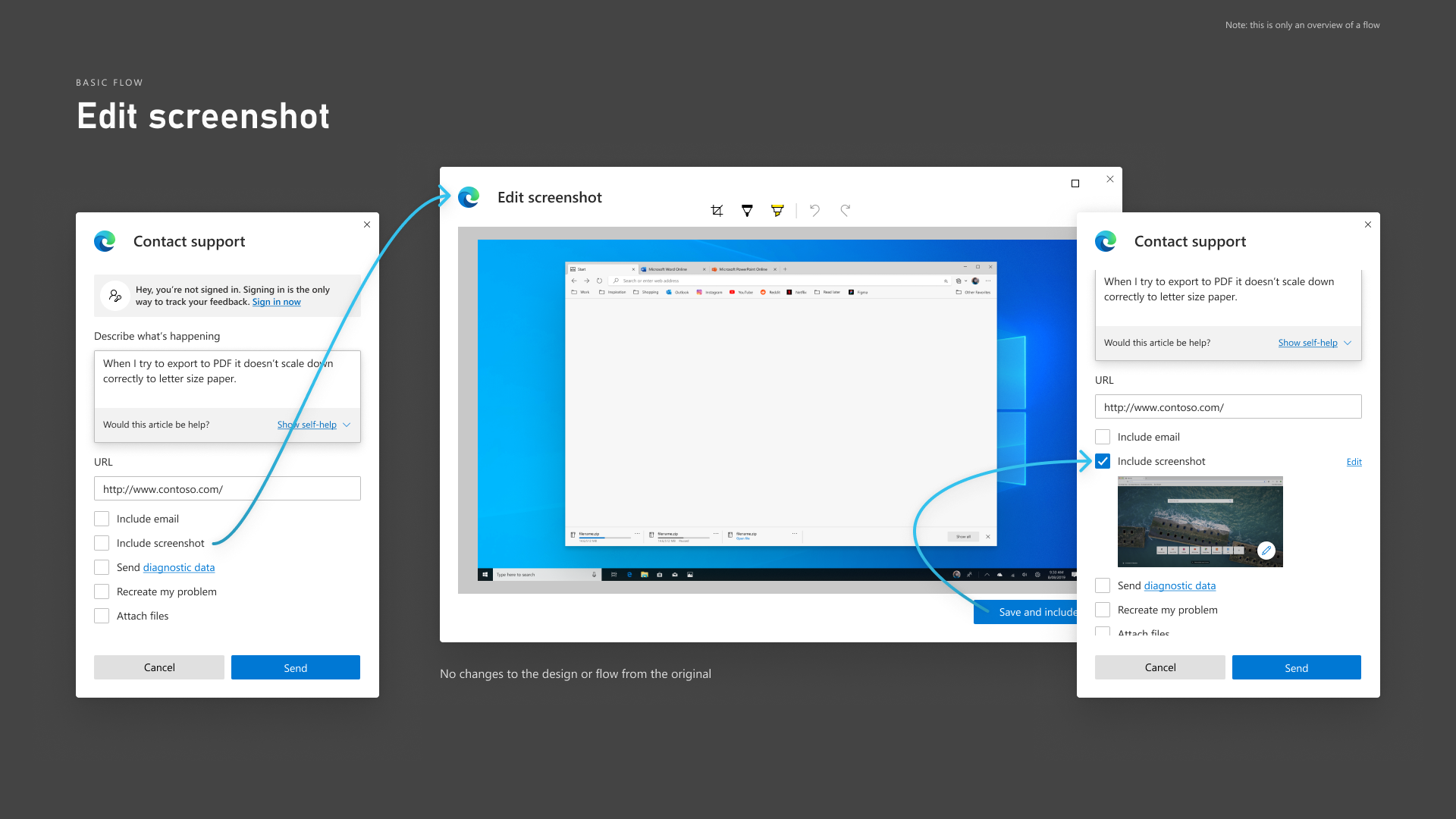
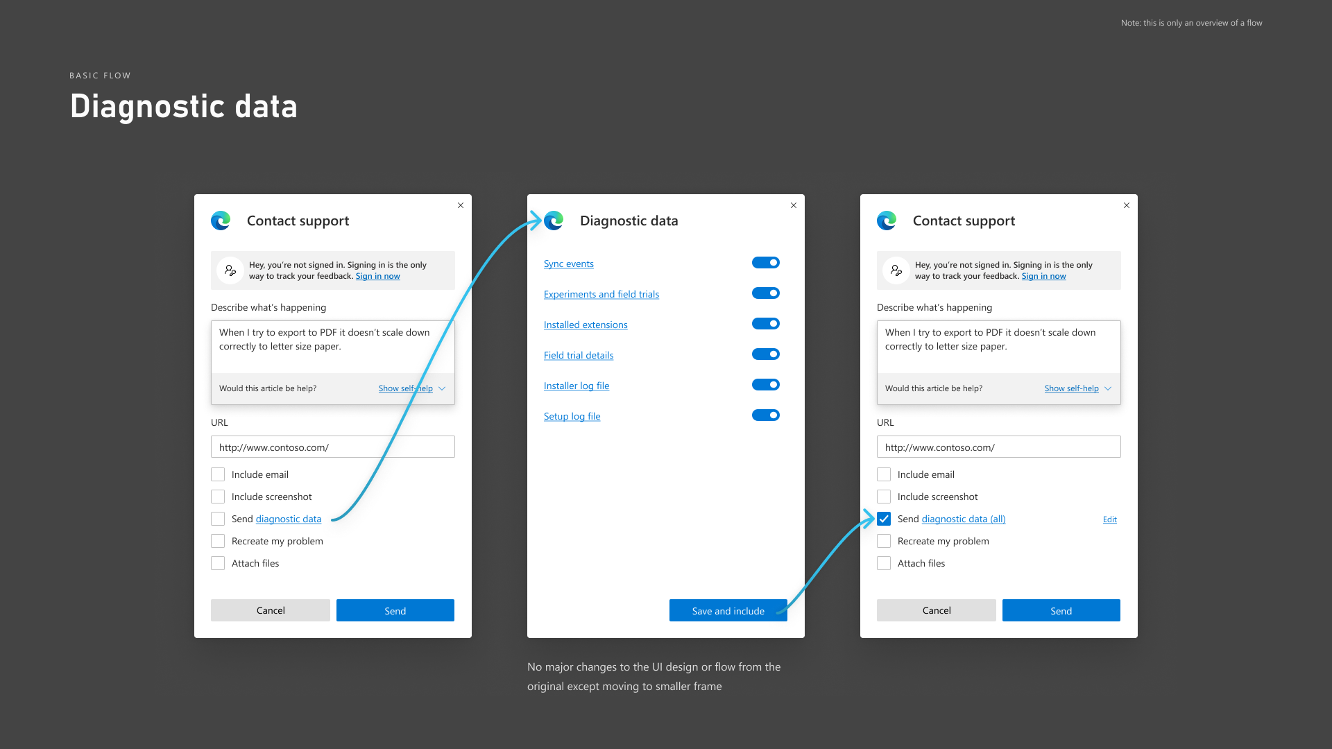
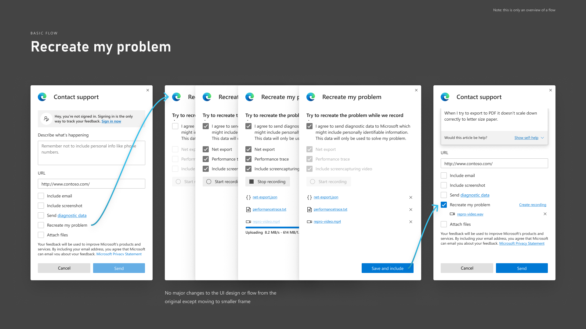
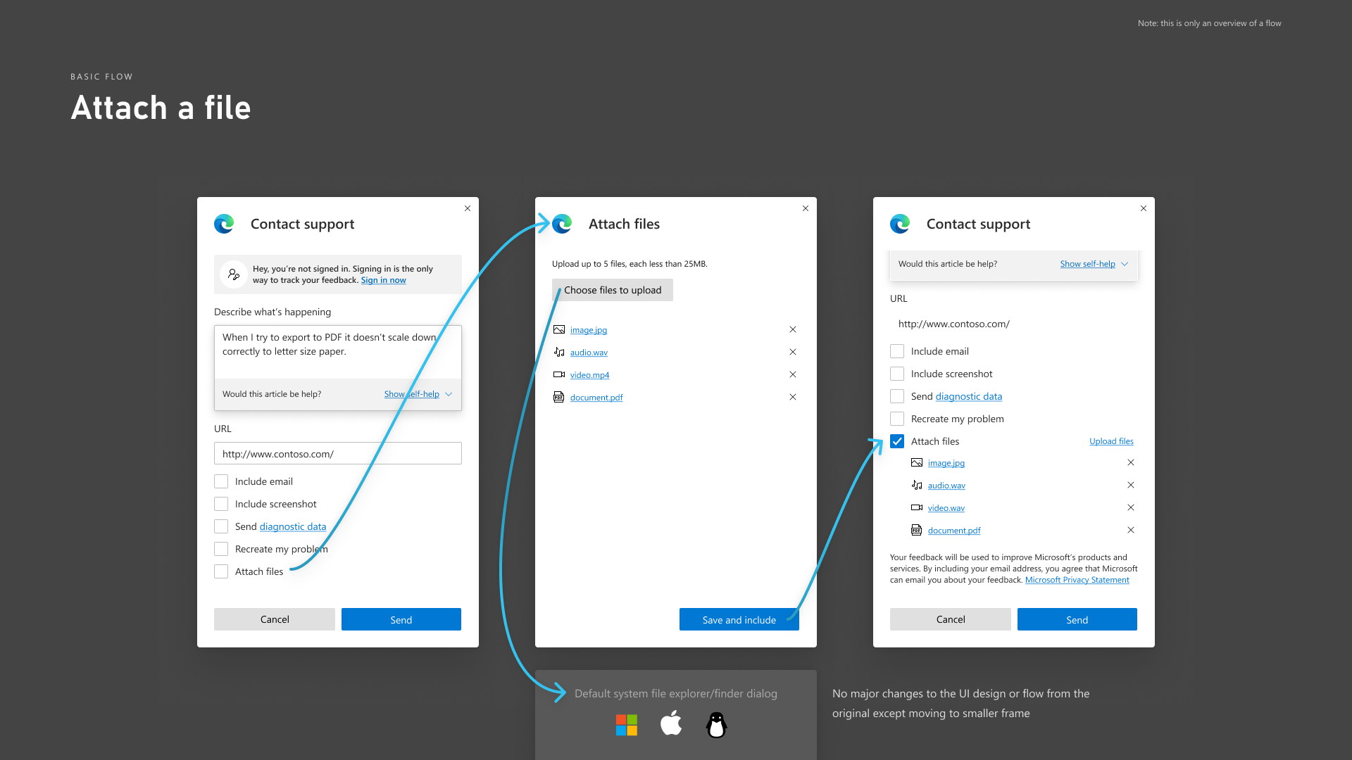
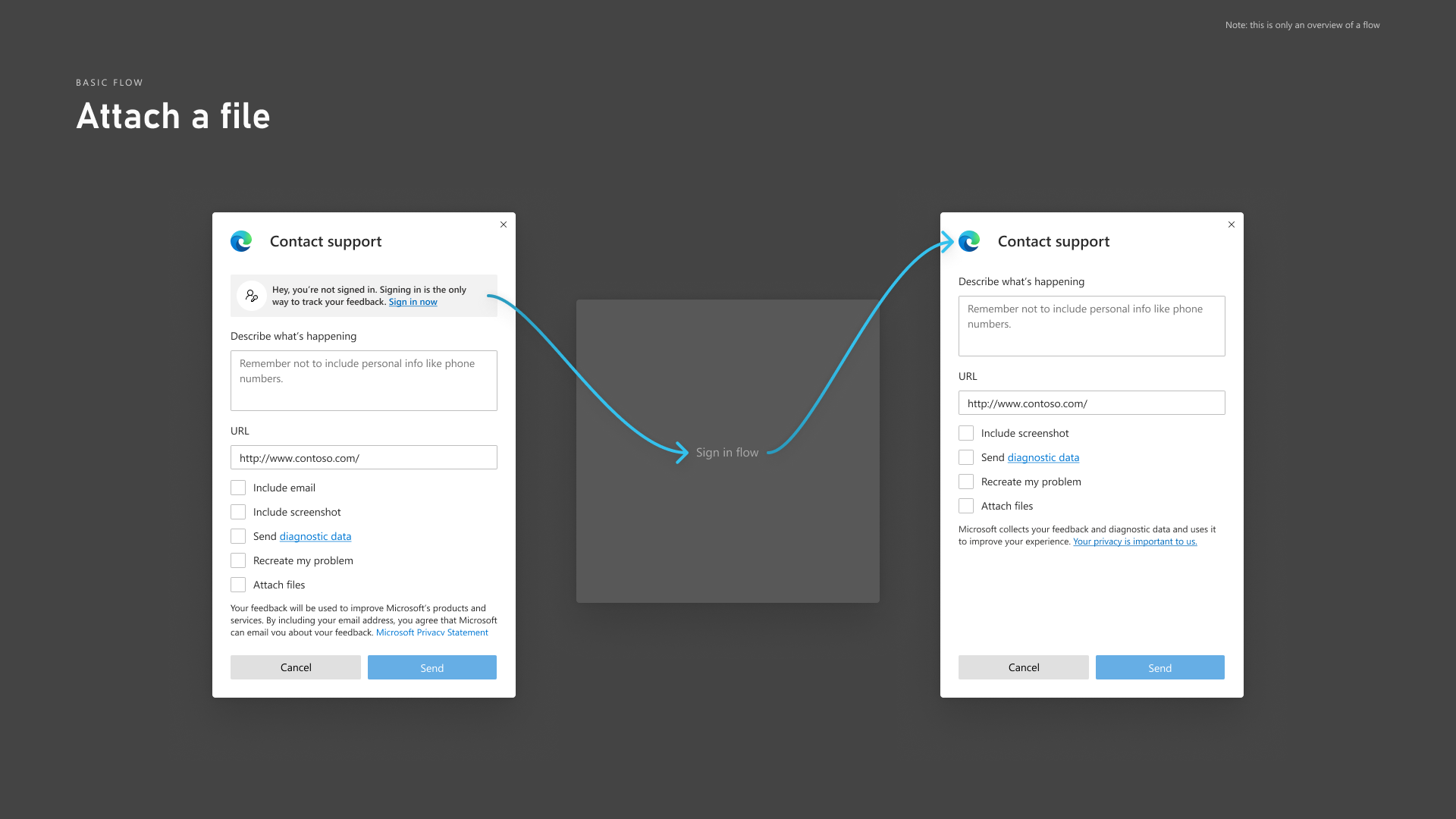
UI Design Recommendations
Out of the blue after a couple of months not hearing back from the customer support team, they requested that I produce a new golden path flow.
Design Handoff
The customer support team wanted to continue with this project but I was unfortunately slated to work on other new features. To smoothly transition the design to their newly hired designer, I produced a document with the designs and notation about some of the decision making that went into the new design.
I have no idea what the fate of this feature, but I'm pretty sure they were going to be okay.